For my next role as concept artist i have prepared the Art bible for the team; the art bible being a visual representation of what we should be going for when we develop the game, this being to keep the team more focused when making design decisions.
The art style for instance we went for is dark and slightly Gothic, emphasising dark colours with higher contrasts between light and dark, this also means we overall have to be careful of our placement of light within the scene as this affects how the player observes the scene.
The character we opted for is a professor/scientist looking character who as a result of early events becomes a ghost, for this we have the design for pre death and post death of the character. in life he has a fairly dusty and grim colour scheme, reflecting the dark times of being on the German side near the end of world war 1. when a ghost the main character is covered in a spectral mist.
Our Gothic styling meant that our level of detail had to take into account a fairly good amount of detail to capture the withered or decayed imagery typically present in Gothic art. so our emphasis on the stone and wood textures is important. its also effective to remind ourselves that we need our propaganda image and books to be fairly good quality because of our setting and narrative. so it helps remind us then need of backing up our design decisions due to narrative assertions.
We strongly asserted early on that our camera was going to be highly controlled, making use of systems like seen in games like Until Dawn, our camera is specifically set to display our scene in controlled angles in order to provide more atmospheric camera angles, whether this is to present the environment in a more aggressive way, or to unsettle our players is up to us.
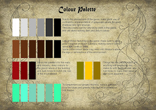
Colour palette's are fairly straight forward, yet are important to remind ourselves of, good uses of grey scale applies excellent contrast in the scene, while our pale tones make our ghost theme more prevalent.
Retreading some ground, we reinforce our setting atmosphere, with the importance for our game to be on the emptyness and cold nature of the environment, so the absence of heat in the environment is crucial as a reminder.
moving onto technical guidelines which act as a good group reminder for how to organise and conduct themselves within programs in order to make sure other members in the group can find their work or identify which pieces they are.
Lastly it all comes down to our inspirations, the art style moodboard received some fabulous inspirations from Bloodborne and Resident Evil, to Tim Burton's unique creepy drawings, and movie's like hotel Transylvania provide some charm to the darker Gothic styling.
The art bible was quite a large source of work, the effort of trying to make sure you sum up many of the key factors for the team to remember in a few pages of a document is definitely challenging. like the excellent examples i was able to find the importance of showing and not just telling is something i was trying to implement.


No comments:
Post a Comment